Side project. After having used the Ryanair customer service several times trough the Chat, I detected that a few user experience improvements can be done.
Role: UX Designer / UI Designer
Tools: Figma
First approach
Positive points
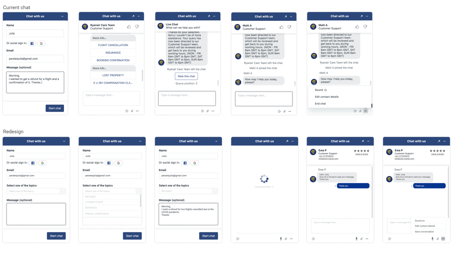
Simple and good design. Follows Ryanair brand guidelines. Users can see the name of the advisor who they are talking with. Users can send images Users can edit their contact details. Users can end the chat whenever they need.
Negative points
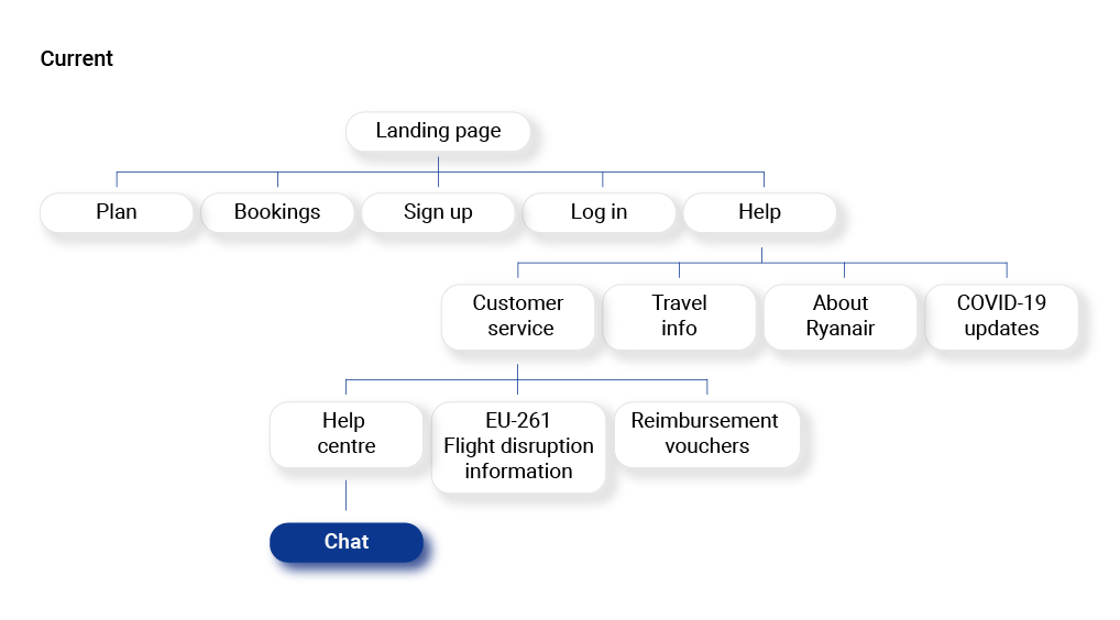
Doesn’t show any customer service email or phone number. Difficult to find the chat feature on the website. Users can’t give an advisor review, only hands up/ hands down button. Users can’t save the conversation and in most cases they don’t receive any confirmation email after an issue is solved or a change is made. Users have to send a message about their query and after select one of default topics they need help about. End conversation button twice.
Potential solutions / propose
Add phone number and email after the advisor’s name. Allows users to have all the contact details in the same place. In that way if the advisor can’t help them, the users don’t need to go to find more assistance somewhere else. Chat button/pop up can show up straight away when user is on the website (as the mail subscription is currently on the landing page). Change hands up/hands down to starts, to being able rate advisors and write a review. Option to save the conversation. Voice option for disability users. Topic selection first and message after. Users can be annoyed to explain twice their need
Low hi fidelity
Wireframes hi fidelity
Assumptions
Pros
Solves users needs.
Happy users: more users will trust and use Ryanair.
Cons
All the solutions are based on the user requirements and not on the business.
Lack of full information of the business side to make a decision of business needs.